A trading idea, tested
Does a support line make a rebound more likely?
A line joining past turning points can look like a floor beneath a falling price. We tested whether prices near that line really were more likely to recover.
The short answer
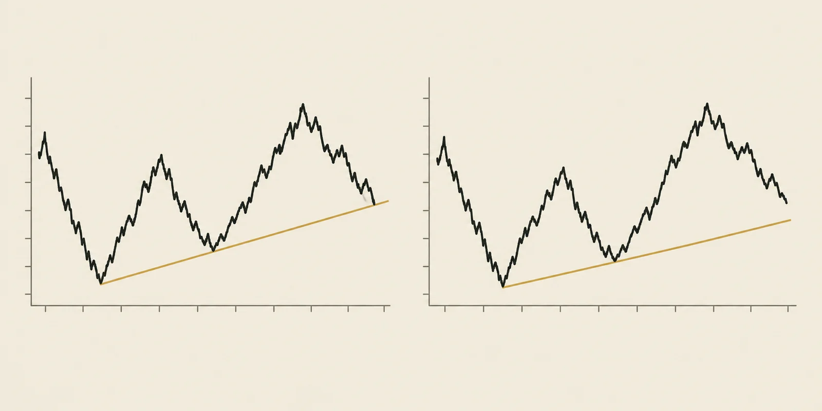
A support line marks where prices recovered before. In this test, it did not make the next recovery more likely: dips near a line bounced less often than dips without one nearby. Past turning points did not give us the reassurance the drawing seemed to offer.
We studied weekly and monthly charts for a selected group of 50 stocks and funds. Study recorded .Why does a support line look reassuring?
Imagine a stock falls to $80 and recovers. Later, it falls to $85 and recovers again. Join those two turning points with a line and extend it forward. You have drawn a support trendline.
Now the price is falling toward that line again. It is tempting to think, ‘Buyers stepped in here before. Maybe they will do it again.’ The line starts to look like a floor beneath the price.
But a drawn floor cannot hold anything up. A price turns because people buy and sell. The line records earlier turning points; we still need to find out whether being near it helps us anticipate the next one.
Illustrative · how the idea works
Join two past lows, then watch what happens next
That is the question we tested: when a price dips near a support line, does it recover more often than a dip without a line nearby?
We compared dips with and without a line nearby
First, we collected dips that came close to support lines drawn by our charting tool. Then we compared them with dips that had no support line close to their low. Looking at both groups matters: prices can recover even when there is no line to point to.
Illustrative · how the idea works
A dip near a line needs a comparison
Near a line
No line nearby
We tried to make the comparison fair by checking how far prices had fallen and whether they had been rising or falling beforehand. The saved research notes describe those checks, though they do not make the two groups identical.
We used the same recovery rule for both groups. On monthly charts, the price had to rise by twice its usual monthly range within six months. For a stock whose monthly high and low are usually $5 apart, a dip to $80 would need to be followed by a rise to $90. Those dollar amounts are an example, not a result from a particular stock.
Illustrative · how the idea works
What counts as a recovery?
We repeated the comparison on weekly charts, using the usual weekly range and allowing six weeks for the recovery. We kept the weekly and monthly results separate because a recovery over six weeks is a different test from one over six months.
What happened?
On monthly charts, about 47 out of 100 dips near a support line recovered enough to count. Without a line nearby, about 55 out of 100 did. The weekly test told a similar story: about 33 out of 100 near a line, compared with 43 without one nearby.
Source: TradingPal research notes, July 8, 2026. Historical observations; these percentages are not trading win rates.
See the exact figures and download the table
| Sample | Group | Rebounds | Observations |
|---|---|---|---|
| Monthly · 2016 onward | Dip near a support line | 46.6% | 569 |
| Monthly · 2016 onward | Dip without a nearby line | 55.3% | 1,341 |
| Weekly · 2022 onward | Dip near a support line | 33.4% | 578 |
| Weekly · 2022 onward | Dip without a nearby line | 43.2% | 3,872 |
Source: TradingPal's research notes from July 8, 2026. The download contains four summary results saved in those notes, not a list of every price movement we studied.
Download summary results (CSV) ↓A useful place to watch is not a promise of a bounce
The results challenged the reassuring picture. In both tests, the group near support lines recovered less often. Simply having a line nearby did not identify dips with better recovery odds in these samples.
This does not mean drawing a line makes a stock perform worse. The two groups can contain different kinds of price moves. Other differences might explain the result; the study does not tell us which explanation is right.
We also explored whether older lines, steeper lines or lines touched more often gave a better clue. The saved notes did not show a consistent advantage in the later periods. They do not give us a reliable rule such as ‘three touches are better than two.’
So imagine the price is approaching the line on your own chart. The line can help you describe what you are watching: ‘This is where the earlier recoveries line up.’ The extra claim, ‘That makes another recovery more likely,’ needs evidence. This test did not supply it.
These results also do not tell you whether buying those dips would make money. They count later recoveries, without simulating the price someone paid, when they sold or what trading cost them.
What this study cannot tell us
This was a comparison of old charts, not an experiment that made the two groups identical. Other differences between the dips could help explain the result. We have the saved summary, but not every original case, so this is a reason to question confidence in the line rather than proof that the line made anything worse.
Read all study limitations
- These are exploratory historical comparisons, not papers reviewed by independent academic experts or a forecast of the next trade. They do not measure a complete trading strategy's return.
- The study used a selected group of 50 stocks and funds. It was not a random sample of the whole market, and failed or delisted businesses were not fully represented. This can change the picture.
- Several observations can come from the same security or from overlapping periods. They are not independent coin flips. The saved summaries do not provide a confidence interval that accounts for that overlap, so we do not claim statistical significance.
- The July 8, 2026 research notes preserve the reported percentages and selected group counts. This edition does not include the original observation-by-observation dataset or an independently repeated analysis. Exact first and last observation dates are not preserved in those summaries.
- This comparison was observational. Matching some features cannot make the two groups identical or remove every alternative explanation. The detailed matching output is not available in this edition.
- Only weekly and monthly results are reported. They do not establish what happens in daily or intraday trading. A six-week rebound rate should not be treated as directly comparable to a six-month rate.
- The study corrected an early comparison that put random lines on the same dip bars. Because those rows share the same future prices, that test cannot reveal whether having a line matters. This report uses the later no-nearby-line comparison recorded in the research note.
For readers who want to check the work
How the study was done, sources and download
- Study universe
- Selected core group of 50 stocks and exchange-traded funds; not a random market-wide sample.
- Line construction
- Recreated older charts with the automatic line tool, keeping its original fitted support lines instead of shifting them toward Fibonacci levels.
- Comparison
- Dips near support lines versus dip bars without a nearby line. The note records matching on dip depth and trend mix; the detailed matching output is not included in this edition.
- Measured outcome
- Counted a rebound when price rose from the dip low by at least twice its recent average range within six weeks or six months. This does not simulate a purchase, sale or trading costs.
- Time split
- Monthly: later sample begins 2016, within a 240-bar replay window. Weekly: later sample begins 2022, within a 500-bar window. Exact observation endpoints are unavailable in the saved summary.
- Available evidence
- Four summary rates and observation counts in a dated research note, plus the code used to collect the observations. The original rows and detailed comparison work were not located for this edition.
Source: TradingPal's research notes from July 8, 2026. The download contains four summary results saved in those notes, not a list of every price movement we studied.
Download methods and limitations (text) ↓Cite this research
Use the article link so readers can see the comparison and its limitations. Please describe the figures as historical rebound rates, rather than trading returns.
TradingPal Research (2026-09-10). Does a Support Line Make a Rebound More Likely? Version 1.0. Historical study recorded 2026-07-08. https://tradingpal.io/learn/research/trendline-support-bounce-study
Questions about the research? Contact TradingPal Research.
Publication and revision record
Version 1.0 · September 10, 2026. First article edition of the study recorded July 8, 2026. The report uses fixed figures; nightly product updates do not change them. Corrections will be dated and explained here.
Keep learning
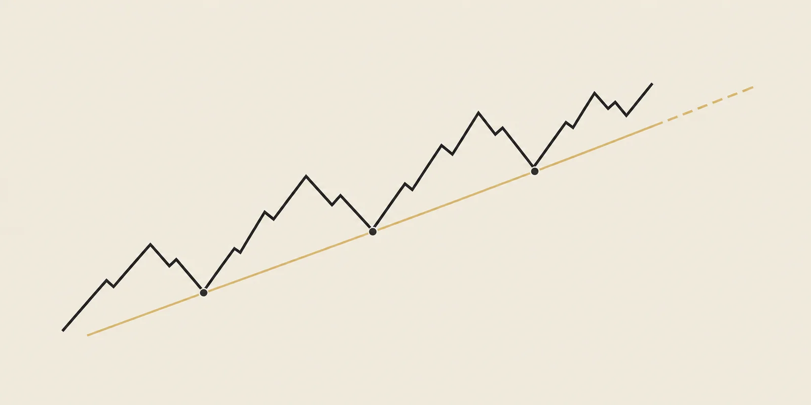
Trend line basics
A trend line joins earlier turning points on a chart.
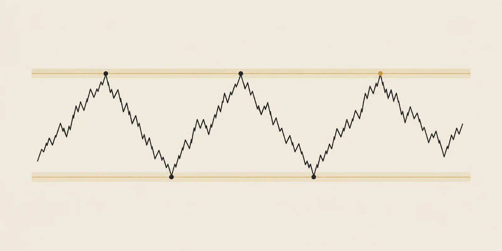
Support and resistance
Support and resistance mark areas where earlier declines or rallies stopped.
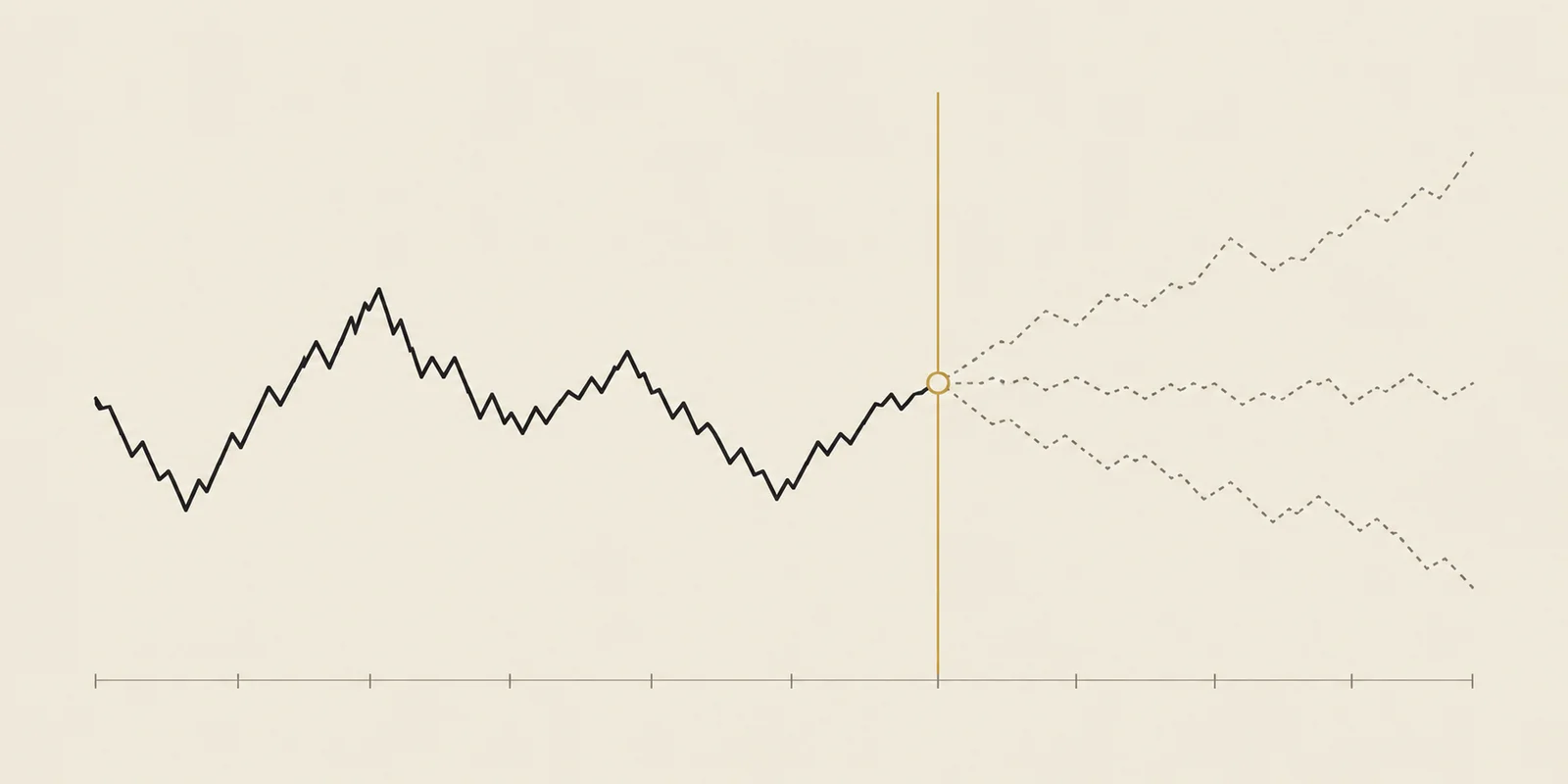
What is backtesting?
Backtesting applies a trading rule to historical prices and records the simulated outcomes.
Another question we tested
Original research ·
Does volume matter before a breakout?
High volume in the completed breakout bar looked favorable. Evidence for volume known before entry was weaker.
Read the study
Original research ·
Do Fibonacci levels help predict a bounce?
We moved the lines to different percentages. Prices recovered about as often.
Read the studyEducational research, not investment advice. Historical observations do not predict the next trade. TradingPal publishes this research and sells trading software.