18.6%To entry--Typical win58.9%Won
PLXSLong
$6.6B capVol 4th percentileRSI 58Hardware & Electronics
A bullish pennant forms when a sharp rally pauses in a small, narrowing range. The guide follows that pause through the entry, exit rules and historical results of a breakout trade.
A bullish pennant is a small triangle that forms after a sharp rise. Imagine a stock climbing from $40 to $50, then trading between $48 and $50 with progressively smaller swings. The rally forms the “pole”; the narrowing pause forms the pennant. These prices are illustrative.
The pattern describes a rally followed by a short consolidation, a period when price stays within a limited range. Traders watching it are asking whether the rally will resume. To turn that question into a trade, they need a price that starts the position and a rule for closing it.
The preceding rally is part of the definition. A similar triangle formed without a sharp rise belongs to a different pattern family.
Use these features to check the shape:
Look at the rally and the pause on the same timeframe. Volume, the number of shares traded, adds context, but the entry rule described below is based on price.
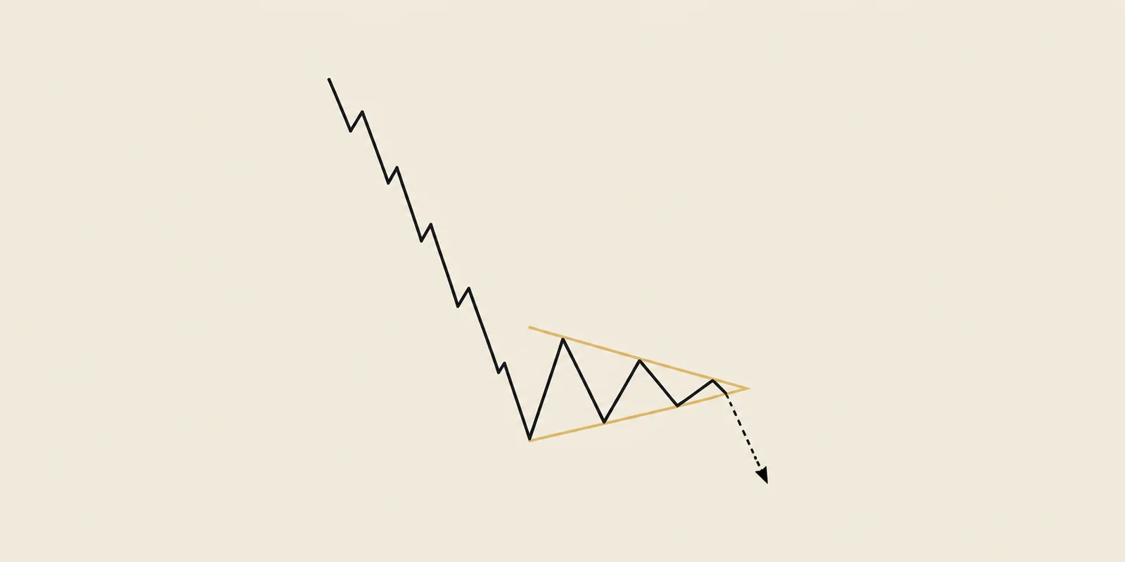
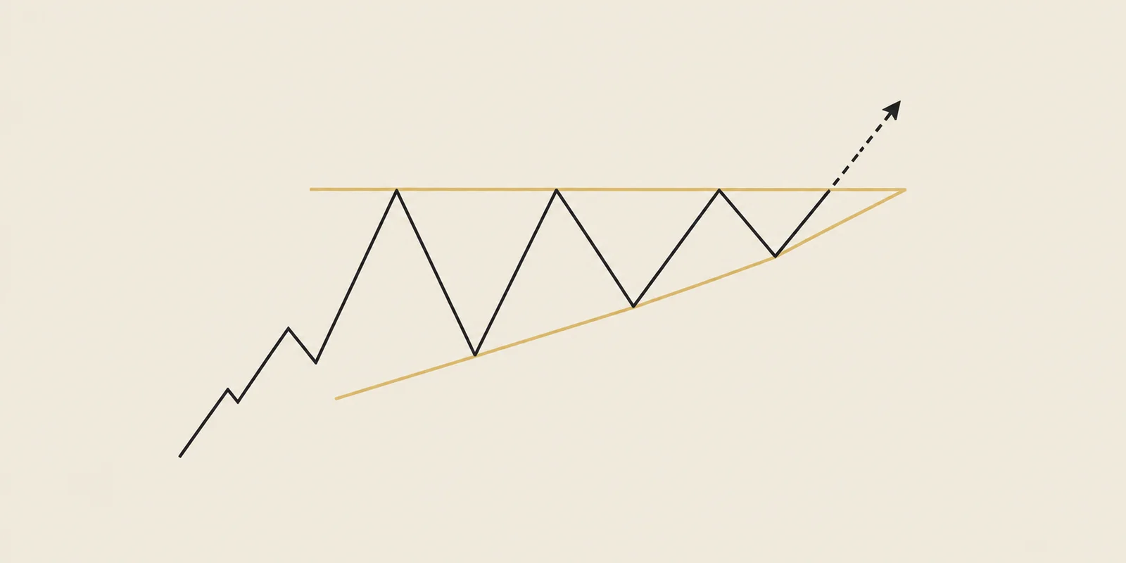
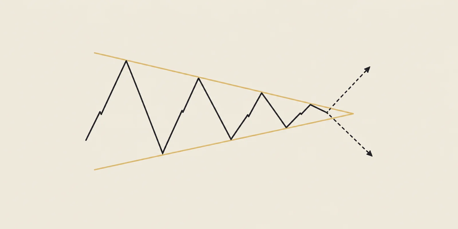
Compare the boundaries and the move preceding the consolidation to distinguish these related patterns.
Illustrative shapes. Compare the move before the pause and the direction of the two boundaries.
The word “bullish” refers to the upward move preceding the pause and the continuation trade people watch for. A pennant can also break below its lower boundary.
For the $40-to-$50 example, the question is whether price rises out of the pause and continues far enough to cover the losses from failed trades. The entry and exit rules let us measure that outcome.
The following steps describe TradingPal’s historical simulation. Choose each step on the diagram to see where the price level sits. The risk/reward guide explains how the distance from entry to the safety exit becomes the planned risk, or 1R.
The simulation places its entry trigger above the upper boundary. The pattern must have been established on an earlier daily candle. The first eligible candle to reach the trigger can fill the order. If price gaps past it overnight, the simulation uses the worse opening price.
The planned invalidation level sits below the last small dip before the breakout. The test closes the trade at the close of a later daily candle beyond that level. Price can overshoot it or gap past it, so the actual loss can exceed the planned 1R.
Measure the pattern’s height at its widest point and project that distance from the entry trigger in the direction of the trade. This is the measured-move target. Reaching the upside target activates a trailing exit based on the 10-day moving average, the average of the last ten daily closing prices. The trade ends on a later close below that average.
A pattern can look convincing and still disappoint as a trade. We tested two familiar trading ideas to see whether they actually helped. Here is what we found in those historical simulations.
A few more bounces between the lines can make a pennant feel safer to trade. But did that extra reassurance pay off?
We checked 9,057 past simulated trades, grouping the patterns by how often price touched their boundaries. The patterns with four touches made more per trade than those with five or six—even though both groups won about 57% of the time. More touches made the chart look more established, without improving the average result.

To compare different stocks fairly, we measured profit against the amount each trade planned to risk. For every $100 of planned risk, the four-touch group averaged about $77 in profit, including the losing trades. The five-or-six-touch group averaged about $46. That is roughly 40% less reward for the risk taken; these figures are not returns on $100 invested.
The useful takeaway: count more than the wins, and do not assume extra touches make a trade better. This compared different patterns, so it does not tell us what waiting for more touches on the same chart would do.
Read the full study: Do more touches make a bullish pennant a better trade? →You spot the breakout late. The stock is still climbing, so buying now feels better than missing it. But the higher price leaves less room to profit and puts the original stop farther away.
We tested that trade-off by moving the purchase to the next trading session’s close and keeping the same stop and final sale. Among 5,870 trades that had already moved away from their entries, buying later left far less reward for the risk.

The original entries averaged about $78 in profit for every $100 of planned risk, including losses. The later entries averaged about $5 for every $100 of their larger planned risk—a drop of roughly 94%. That describes how much reward the risk earned, not a 94% loss of invested money.
This test covered several patterns and only trades still open at the later purchase, so the number is not specific to pennants. The lesson is simple: when the price changes, check the trade again. A stock can keep rising while the opportunity to buy it gets worse.
Read the full study: Why buying a breakout late can erase most of the reward →The table summarizes simulated trades using the entry and exit rules above. Check the direction, sample size and measurement period before comparing rows. These results update when a new historical run is published.
Read win rate together with the size of the wins and losses. A strategy can win half its trades and still gain or lose overall. Average R and profit factor help explain which happened; the track-record metrics guide covers the calculation.
The published pattern group includes shapes that passed later confirmation checks. That can affect which historical trades enter the sample, even when the simulated fill uses prices available at the time. The backtesting methodology explains this limitation and the portfolio assumptions.
Historical results of the simulated strategy described above (2006-09-11 – 2026-09-09), refreshed nightly — not a prediction. How we test →
The examples below are selected completed trades from the historical simulation. Compare the entry and exit in each, including the losing trades. Opening a symbol takes you to its current chart.
Selected for learning, with a mix of wins and losses where available. Closed in the 90 days ending Sep 11, 2026. This selection is not a win-rate sample.
Our screener re-draws the lines on 2,600+ symbols every night and flags each one whose chart currently fits the checklist above. The current matches appear below.
86 fresh bullish pennants formed in the last 45 days across our growing universe of 2,600+ scanned symbols (124 charts tracked for this pattern in total). Scan updated Sep 11, 2026.
86 structures found. See example
The day's #1 ranked setup, in your inbox.
Every morning we hand you the highest-ranked breakout structure found in our scan across 2,600+ tickers — Free.
See the full offeringThe stocks with the strongest historical hit rate for this pattern in our backtest (minimum sample applied).
| Stock | Win rate | Avg return | Trades |
|---|---|---|---|
| JLLJones Lang Lasalle | 68.4% | +9.9% | 12 |
| FITBFifth Third Bancorp | 67.5% | +8.0% | 8 |
| VMCVulcan Materials | 67.5% | +13.2% | 8 |
| CDNSCadence Design Systems | 66.3% | +7.5% | 10 |
| FMXFomento Economico Mexicano S.A.B. De C.V | 66.3% | +7.1% | 10 |
| ICLRIcon | 66.3% | +9.4% | 10 |
| TDGTransdigm | 66.3% | +9.5% | 10 |
| AEISAdvanced Energy Inds | 65.2% | +14.5% | 9 |
| BWABorgwarner | 65.2% | +11.7% | 9 |
| ETEnergy Transfer | 65.2% | +8.7% | 9 |
A pennant following a sharp rise is called bullish; one following a sharp fall is called bearish. Either can break against the direction of that earlier move.
Both follow a sharp rise. The pennant narrows into a triangle, while the flag has roughly parallel boundaries.
The historical table reports the results of the stated entry and exit rules. Read win rate alongside average R, profit factor and sample size; changing the rules changes the question being tested.
On a daily chart it is a short consolidation after a sharp rally. A prolonged consolidation may fit a triangle better; the relationship between the rally and the pause matters as well as duration.
An upward breakout can reverse and cross the planned safety-exit level below the last dip. The test closes on a later daily close beyond that level, so the loss can exceed the planned risk.
A bearish pennant is a narrowing pause after a sharp decline.
An ascending triangle combines repeated highs near one price with rising lows.
The swings get smaller, but the next move can go either way.
Educational content, not investment advice. Backtest statistics are historical results of a simulated strategy, refreshed nightly — they describe the past, not the next trade.